Crochet Color and Texture
Unintended Consequences of Fiber Combos
by Julia Meek Chambers – Aberrant Crochet ™
When discussing custom orders with my customers, the subject of fiber/color combinations and texture often comes up. The more you work with fiber art and a variety of projects, the more obvious it becomes that texture plays a huge role in the visual outcome of a project due to its three-dimensional nature. Fiber alone is not just a shade of color, but a texture that is visual as well as tactile. There are smooth fibers and rough fibers, shiny ones and dull, and any variety in between. These qualities greatly affect how the human eye visually perceives color and the blend of colors in a finished fiber product. As a three dimensional product, there are natural variations in how the eye perceives color and shading on the various surfaces involved. As such, the visual assessment of three-dimensional work is much different than that of the two-dimensional.
The before and after stages of the felting process are a fine example of how a product’s appearance can look different to us, simply due to the change in texture, not the actual color itself. You can see an example of this difference in a before and after felting photo from Dr. Carol Ventura’s website here. But this becomes true in any use of yarns and fibers and never more so than in crochet. (Btw, Dr. Carol Ventura is the leading go-to gal for tapestry crochet.)
The look of crochet, by its very nature, is built upon variations of texture via stitches alone. When students ask, “How many different crochet stitches are there?” The answer is simply: hundreds that are documented and an infinity of possibilities. The solitary hook truly has very few limitations as a creative tool.
When you calculate the texture of your fibers into the equation, the visual possibilities in your projects become magnified and without a little preventative effort, can sometimes even bring frustration. As such, careful consideration should go into how fibers will look together in a fabric of stitches, not just by themselves wrapped into a skein.
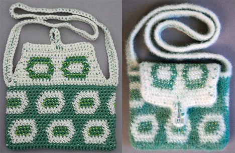
More times than not, I find customers picking through beautiful fibers for combinations of colors that visually would look fine, if mixed on a flat surface. However as fibrous textures they just simply cannot mesh into the same outcome.
When picking your fibers for a blended project, crochet a swatch to see how the fibers work together as a fabric piece. Keep in mind what form of stitches you plan to use to create the fiber combination. The colors of some fibers perform best when used in looser stitches than in tighter ones. Some fibers are simply overpowering in a combination and render others pointless. If crocheting a swatch first is not possible, try taking the fibers and weaving them together around your fingers a bit to get an idea of how the textures will play off each other. In doing so you may save yourself a lot of frogging and grief. Just like painting your house, the more time spent in preparation will yield a more beautiful product.
Copyright © 2003 – 2009 by Julia Meek Chambers, all rights reserved.


 Crochet Liberation Front:


It is the truth.
Great piece! I sure wish I’d seen this before I started crocheting. While I can feel and see the differences when healing yarn, there have been several times when I’ve been absolutely stumped about which I was going to use for what and how! LOL
I’m glad you like the article Gretchen! Thanks for stopping by to share. 🙂